A masonry grid looks simple: variable-height cards, left-to-right reading order, columns that fill naturally. You reach for column-count in CSS because that’s what the tutorials recommend. Everything looks correct on your three uniform-height test cards. Then you add real content – cards with different amounts of text, images, tags – and the order breaks. Card 4 appears before card 2. Card 7 jumps to the top of column 1. The layout is shuffled.
I hit this on my portfolio’s blog and projects pages – the same kind of problem that shows up in any real MVP development project once you move from placeholder content to real data. I found the popular fix, implemented it, and watched it fail in production. Then I built an approach that actually works. Here’s what the popular fix gets wrong and what to do instead.
Why column-count Breaks Ordering
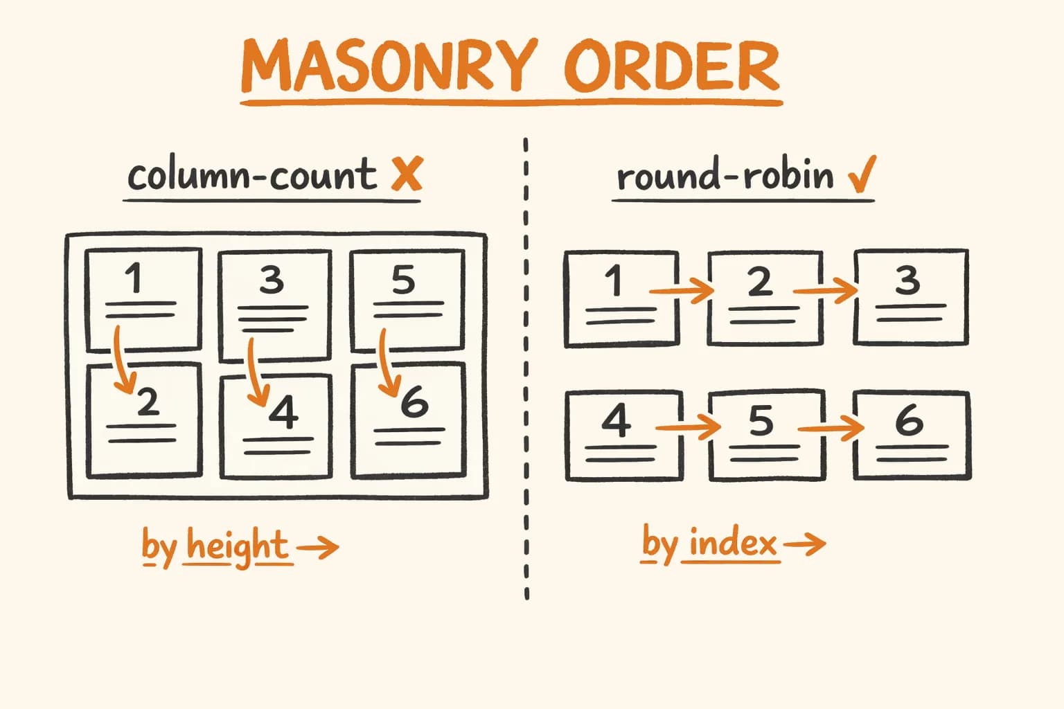
CSS column-count is a newspaper-layout primitive. You give it a container and a number of columns, and the browser fills those columns top-to-bottom – not left-to-right. The first column fills completely before the second starts.
That’s the correct behaviour for newspaper text. It’s the wrong behaviour for a card grid where reading order should go left-to-right across the top row.
Items: [1, 2, 3, 4, 5, 6]
column-count: 3

What CSS does:           What you want:
┌────┬────┬────┐         ┌────┬────┬────┐
│ 1  │ 3  │ 5  │         │ 1  │ 2  │ 3  │
│    │    │    │         │    │    │    │
│ 2  │ 4  │ 6  │         │ 4  │ 5  │ 6  │
└────┴────┴────┘         └────┴────┴────┘
The standard fix that circulates on Medium and in Stack Overflow answers is to reorder the array in JavaScript before rendering it into the column-count container – placing items in column-reading order so that CSS’s top-to-bottom fill produces the correct left-to-right result.
The Popular Reorder Algorithm – And Why It Fails
Jesse Korzan published a clean write-up of this technique on Medium with a live demo. The idea is elegant: instead of passing [1, 2, 3, 4, 5, 6] to the CSS column container, reorder it to [1, 4, 2, 5, 3, 6] so that CSS fills column 1 with items 1 and 4, column 2 with items 2 and 5, column 3 with items 3 and 6 – producing the correct left-to-right reading order.
The solution is correct under its own assumption. The problem is the assumption itself.
// ❌ This approach breaks with variable-height cards
function reorder<T>(items: T[], cols: number): T[] {
  const out: T[] = [];
  for (let col = 0; col < cols; col++) {
    for (let i = col; i < items.length; i += cols) {
      out.push(items[i]);
    }
  }
  return out;
}
Usage:
// ❌ Broken in production — see explanation below
<div style={{ columnCount: 3, columnGap: "1.5rem" }}>
  {reorder(posts, 3).map((post) => (
    <div key={post.slug} style={{ breakInside: "avoid" }}>
      <PostCard post={post} />
    </div>
  ))}
</div>
The algorithm assumes CSS will put exactly Math.ceil(N / cols) items into each column. That assumption is only valid when every card has the same height.
When cards have different heights – which is always true for real content – CSS distributes items by pixel height, not by count. A tall card in column 1 means that column fills up with fewer items. Column 2 then starts earlier, takes more items, and fills faster. By the time you reach the last column, the distribution is completely different from what the reorder algorithm predicted.
6 cards, heights: [300px, 100px, 150px, 200px, 100px, 250px]
Column target height: ~333px each

Algorithm expects:         CSS actually produces:
Col 1: items 1, 4          Col 1: item 1 (300px) → full
Col 2: items 2, 5          Col 2: items 2, 3, 5 → 350px
Col 3: items 3, 6          Col 3: items 4, 6 → 450px

Result: items appear in wrong visual positions
The reorder step produces the right order for equal-height cards. For real cards, you’ve just shuffled the content in a way that makes the visual order less predictable, not more.
The reorder trick is only correct when all cards have identical heights. With real content — varying text lengths, images, tag counts – the algorithm makes ordering worse, not better.
The Correct Approach: Replace CSS Columns With JS Columns
The fix is to stop using column-count entirely. Instead of one CSS container that CSS distributes into columns, create N separate <div> elements – one per column – and distribute items into them in JavaScript using round-robin assignment.
item 0 → col 0
item 1 → col 1
item 2 → col 2
item 3 → col 0  ← back to col 0
item 4 → col 1
item 5 → col 2
The key insight: when JS controls which column each item goes into, CSS has no say in the distribution. Card heights don’t matter. The reading order is always exactly what you specified.
With round-robin assignment, row 1 always contains items [0, 1, 2], row 2 always contains [3, 4, 5] – regardless of how tall each card renders. CSS still controls the visual layout (flex row, gap, column width), but the distribution decision is made entirely in JS before render.
The trade-off: you lose CSS’s ability to balance column heights. With column-count, CSS naturally puts more items in a column if the previous items were short. With the JS approach, each column gets exactly Math.ceil(N / cols) items – columns with shorter cards will have more whitespace at the bottom. For most portfolio and blog grid use cases, consistent reading order matters more than height balancing.
Full MasonryGrid Component
Here is the complete TypeScript component, 60 lines including the breakpoint hook:
"use client";

import React, { useEffect, useLayoutEffect, useState, ReactNode } from "react";

// useLayoutEffect on client, useEffect on server (Next.js SSR compatible)
const useIsomorphicLayoutEffect = typeof window !== "undefined" ? useLayoutEffect : useEffect;

interface Breakpoints {
  default: number;
  sm?: number;
  md?: number;
  lg?: number;
}

function getColumns(bp: Breakpoints): number {
  const w = window.innerWidth;
  if (bp.lg && w >= 1024) return bp.lg;
  if (bp.md && w >= 768) return bp.md;
  if (bp.sm && w >= 640) return bp.sm;
  return bp.default;
}

function useColumns(bp: Breakpoints): number {
  const [cols, setCols] = useState(bp.default);
  useIsomorphicLayoutEffect(() => {
    setCols(getColumns(bp));
    function update() {
      setCols(getColumns(bp));
    }
    window.addEventListener("resize", update);
    return () => window.removeEventListener("resize", update);
  }, []); // eslint-disable-line react-hooks/exhaustive-deps
  return cols;
}

interface MasonryGridProps {
  children: ReactNode;
  gap?: string;
  breakpoints: Breakpoints;
}

export function MasonryGrid({ children, gap = "gap-6", breakpoints }: MasonryGridProps) {
  const cols = useColumns(breakpoints);

  // Round-robin distribution: item i goes to column (i % cols)
  const childArray = React.Children.toArray(children);
  const columns: ReactNode[][] = Array.from({ length: cols }, () => []);
  childArray.forEach((child, i) => columns[i % cols].push(child));

  return (
    <div className={`flex ${gap}`}>
      {columns.map((col, colIdx) => (
        <div key={colIdx} className={`flex-1 flex flex-col ${gap}`}>
          {col}
        </div>
      ))}
    </div>
  );
}
Usage on the blog page:
<MasonryGrid gap="gap-6" breakpoints={{ default: 1, md: 2, lg: 3 }}>
  {filtered.map((post) => (
    <ContentCard key={post.slug} item={post} />
  ))}
</MasonryGrid>
A few implementation notes:
useIsomorphicLayoutEffect — Next.js renders on the server where window does not exist. useLayoutEffect throws a warning in SSR context. The isomorphic pattern falls back to useEffect server-side, which is a no-op, and uses useLayoutEffect client-side so the column count is applied before the first paint – preventing a flash of single-column layout on page load.
bp.default as SSR value – useState(bp.default) means the server always renders the smallest column count. On hydration, useIsomorphicLayoutEffect fires synchronously and updates to the correct column count for the viewport. This produces the correct layout with zero layout shift for most visitors, since default: 1 renders a valid single-column layout that gets upgraded immediately.
flex-1 on column divs – columns share available width equally. This is simpler than computing width: calc(100% / cols) and works correctly with arbitrary gap sizes.
Gap as a Tailwind class string – gap="gap-6" lets the caller use any Tailwind spacing token. The same gap applies both between columns (on the flex row) and between items within a column (on the flex column). Passing separate horizontal and vertical gap props is straightforward if you need them.
A Note on Native CSS Masonry
CSS is getting native masonry layout via the display: masonry / grid-template-rows: masonry spec (currently renamed to CSS Grid Lanes). Safari 26.4 shipped stable support. Chrome and Firefox have it behind flags.
/* ❌ Not production-ready — 0.02% global browser support (early 2026) */

/* Older spec name — still referenced widely */
.grid {
  display: masonry;
  masonry-template-tracks: repeat(3, 1fr);
  gap: 1.5rem;
}

/* Newer name (CSS Grid Lanes) — same situation */
.grid {
  display: grid-lanes;
  grid-template-columns: repeat(3, 1fr);
  gap: 1.5rem;
}
You will see both names in articles and browser release notes – display: masonry was the original proposal, display: grid-lanes is the current direction after the CSS Working Group renamed the spec in 2024. They are the same feature at different stages. Neither is production-ready: only Safari 26.4 ships stable support, Chrome and Firefox are behind flags. Global coverage in stable browsers is approximately 0.02% as of early 2026. Until this lands across all engines, the JS approach in this post is what you ship.
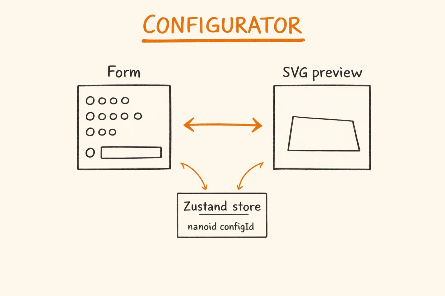
Reading order in a masonry grid is one of those problems that looks solved until you add real content. The same pattern – ‘works on test data, breaks on production content’ – appears in many places. The pikkuna SVG configurator is another example of a UI that required careful rendering control with real product data. The popular reorder algorithm assumes equal heights – a constraint you can’t guarantee in any real application. Separate flex columns with round-robin JS distribution is the correct fix: reading order is always exact, the implementation is transparent, and it works in Next.js without any client-side workarounds beyond the isomorphic effect hook.
I build portfolio sites, SaaS frontends, and e-commerce UIs where layout correctness matters. If you need a senior developer who handles the full stack – from grid algorithms to checkout flows – get in touch.
Related reading:
- How I Synced 6 CSS Keyframe Animations Without a Single Library – more CSS-from-first-principles work
- Dynamic OG Images in Next.js: Why opengraph-image.tsx Hangs Turbopack – another case where the documented approach breaks in production
- Jesse Korzan – Masonry Layout Technique (Medium) – the original reorder technique, works perfectly with uniform card heights
- CSS Grid Level 3 – Masonry Layout (W3C draft spec for native masonry)
- MDN: column-count – official reference for the CSS primitive