Nobody has ever emailed me to complain about a straight quote where a curly one belongs. Nobody has ever pointed out that a page used an em dash in one paragraph and a hyphen doing the job of a dash three paragraphs later. I doubt more than a handful of visitors to any site could tell you, if you asked directly, what the correct dash even is.
And yet they notice. Not consciously – nobody reads a landing page thinking ‘hm, inconsistent punctuation.’ But somewhere below that, a site that gets these details right reads as made with care. A site that doesn’t reads as assembled, quickly, by whoever was cheapest or fastest. Same words, same layout, same offer – different trust, for a reason the reader couldn’t name if you asked them to.
What ‘Right’ Actually Looks Like
Here’s the same sentence, once with the typography most software leaves you with by default, and once with it corrected for a British-English reader – curly quotes, proper dashes, a real ellipsis character instead of three dots, spacing that respects the punctuation around it:
She asked, "Isn't this the shop they call 'round the corner'?" ... We'd
walked - nearly 3 km - just to find it closed.
She asked, ‘Isn’t this the shop they call “round the corner”?’ … We’d
walked – nearly 3 km – just to find it closed.
Read the first version. It’s fine. Perfectly legible. Nothing about it screams ‘wrong’. Now read the second one right after it. It just sits better – the quotes nest properly instead of fighting each other, the dash reads as a pause instead of a stray minus sign, the ellipsis is one calm character instead of three periods bumping into the next word.
That difference is the whole article. It’s not dramatic. That’s the point: it’s not supposed to be dramatic. It’s supposed to be invisible when it’s right and only faintly, unaccountably ‘off’ when it’s wrong.
Even a Careful Site Gets This Wrong
I didn’t write that before/after pair by hand – it’s real output from a locale-correct typography engine I built and shipped this year, polytypo, which you can run on your own text at polytypo.dev. This week I ran it across every public page of this site, built up over more than a year, one article and one service page at a time.
It caught real inconsistencies I hadn’t noticed while writing any single page: an em dash on one article where the rest of the site used a spaced en dash, straight apostrophes sitting two paragraphs from curly ones, the odd stray hyphen standing in for a proper dash. None of it was wrong on any one page in isolation. It only became visible once something checked every page against the same rule at once. I’d been maintaining this site carefully for over a year and it still drifted – which is exactly the point: this isn’t a mistake careless people make. It’s a category of work nobody notices they’ve skipped until something goes and checks.
The Bigger Pattern This Is Standing In For
Typography is a convenient example because you can see it in one sentence. But it’s a stand-in for a whole category of work that shares its shape: correct, invisible when done, and never on anyone’s feature list. A checkout that recomputes the total instead of trusting the number the browser sent. A webhook handler that doesn’t create a second invoice when the retry arrives. VAT applied correctly for the buyer’s actual country instead of whatever the developer tested with. None of these earn a line in a pitch deck. All of them are the difference between software that was finished and software that was shipped once it looked finished.
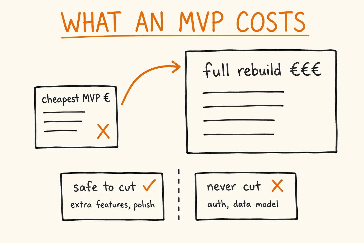
I wrote about the bigger, costlier end of that same pattern in what an MVP actually costs – the ‘unglamorous 30%’ that a cheap quote quietly cuts because it doesn’t show up in a five-minute demo. Typography is the smallest, cheapest, most harmless-looking member of that family. Which makes it a useful test: if a team cut corners here, on something this visible and this low-stakes, what are the odds they cut corners on the parts you can’t see at all?
Who This Actually Matters To
This isn’t a pitch to sell you typography fixes. It’s genuinely not worth commissioning on its own – whoever builds your site can run this kind of pass for free in minutes, and I’d tell you that even if I sold typography audits, which I don’t.
It matters if you’re trying to read a signal you can’t put your finger on: why one option in a shortlist just feels more trustworthy than the others, on paper equally qualified. It’s rarely one dramatic thing. It’s usually a dozen small things like this one, each individually shrug-worthy, adding up to a read on how much the people building it actually cared about the parts nobody was going to grade them on.
It doesn’t matter if you’re optimising for speed to a rough first version and you know that’s what you’re doing – ship the plain quotes, fix it later, that’s a legitimate call for a prototype nobody’s judging yet. The problem is only when ‘later’ is the plan for the parts a customer’s trust actually rests on, and nobody ever says so out loud.
If you’re trying to tell a genuinely careful build from one that just looks finished on the surface, that’s worth a real conversation before you sign anything. Let’s talk.