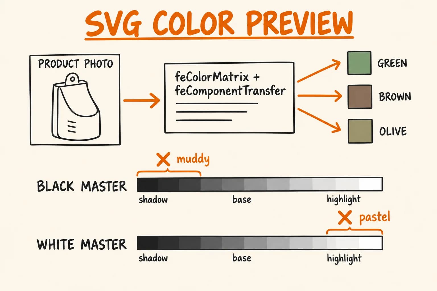
Short answer: yes, one SVG filter can recolor a transparent-background product photo to any color. A feColorMatrix that desaturates the image, followed by a three-stop feComponentTransfer table, is about twenty lines. It works. But the result depends on the tonal range of the photo you feed it, and on the masters I tested that dependency pushed the colors darker or lighter than requested.
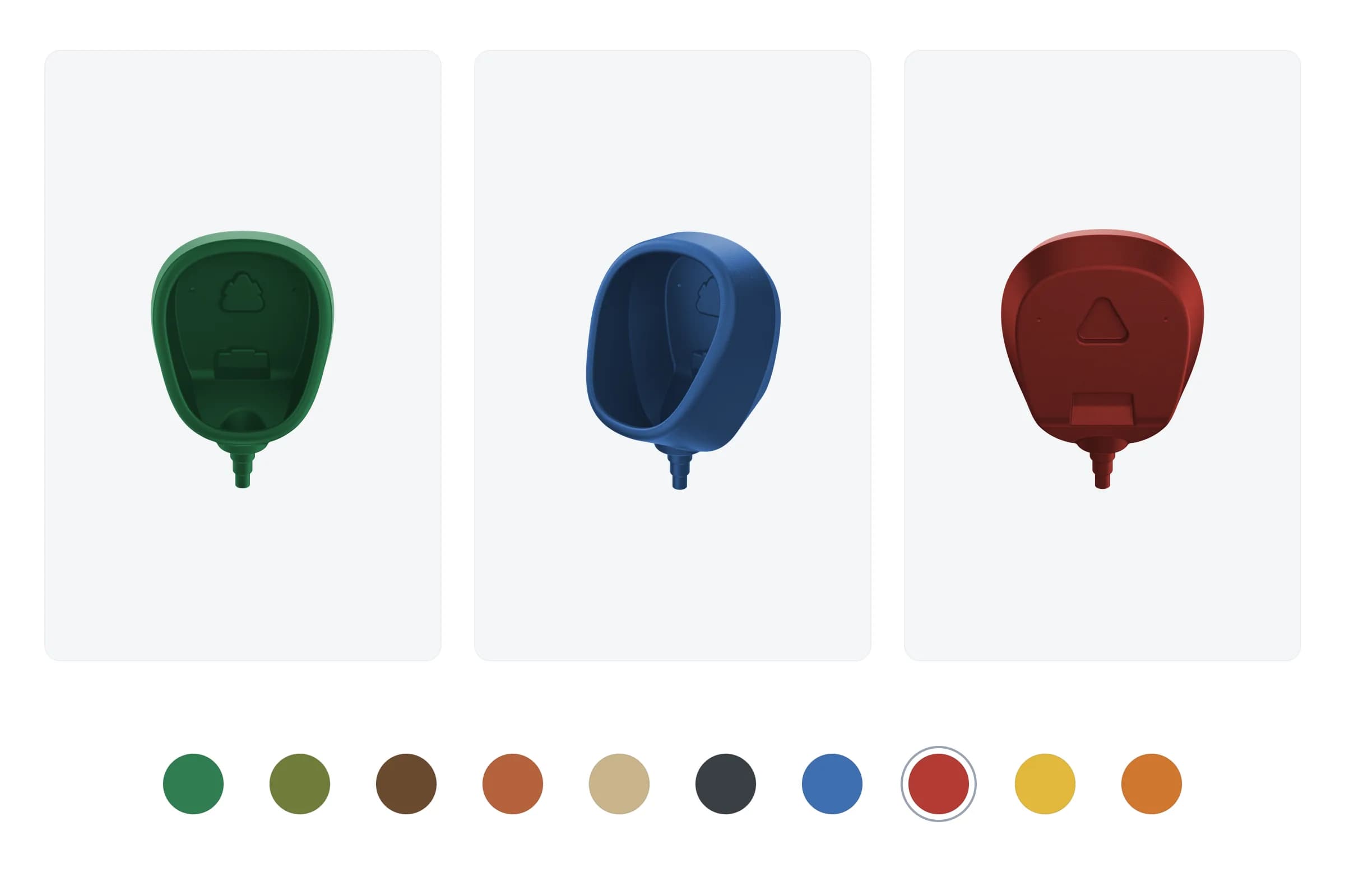
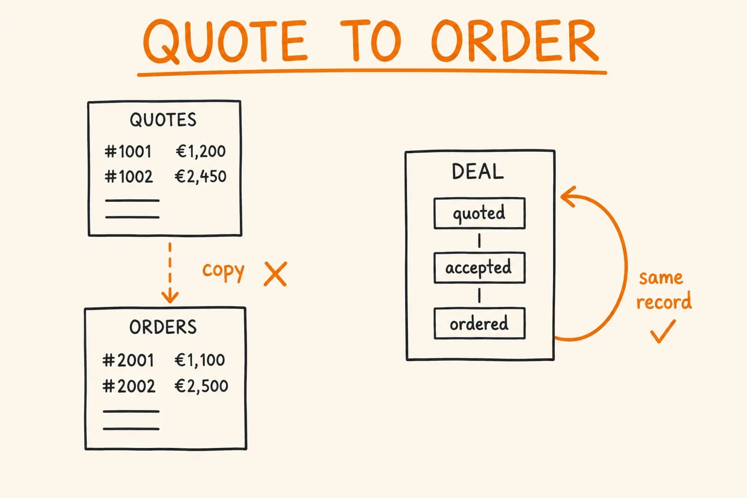
I found this while building a color preview for pi-pi.ee, an online shop I built. The shop stocks black, grey and white products; other colors are made to order, and a buyer has to imagine them. I wanted a live preview. I built the first version with an SVG filter and replaced it the next day. I measured both versions later, for this article, so you can decide whether the simple one is enough for your photos. The shop-side context (color names, the order request) is in the case study.
How the filter works
The idea is a duotone: take the photo’s brightness, then map it onto a ramp that runs from a dark version of the target color, through the target color, to a lighter version. The photo’s own shading survives because brightness is the input.
Here is the shape of the filter, trimmed from the first version. It is applied to the photo with CSS filter: url(#tint):
const SHADOW_MUL = 0.28;
const HIGHLIGHT_MIX = 0.68;

// channel is one of the target color's R, G, B values, 0..1
const ramp = (c: number) => [c * SHADOW_MUL, c, c + (1 - c) * HIGHLIGHT_MIX].join(" ");

<filter id="tint" colorInterpolationFilters="sRGB">
  <feColorMatrix type="saturate" values="0" />
  <feComponentTransfer>
    <feFuncR type="table" tableValues={ramp(r)} />
    <feFuncG type="table" tableValues={ramp(g)} />
    <feFuncB type="table" tableValues={ramp(b)} />
  </feComponentTransfer>
</filter>;
saturate with value 0 turns the photo grey, so R, G and B all equal its luminance. Each feFunc with type="table" then maps that value through a piecewise-linear lookup. With three values, the input range splits into two halves:
| Stop | Value | Input luminance | Meaning |
|---|---|---|---|
| 1 | c × 0.28 | 0 | shadow: 28% of the target channel |
| 2 | c | 0.5 | base: the requested color itself |
| 3 | c + (1 − c) × 0.68 | 1 | highlight: 68% of the way to white |
Luminance from 0 to 0.5 interpolates from shadow to base. From 0.5 to 1 it interpolates from base to highlight. Because the table is applied per channel, the same lookup tints all three channels at once.
colorInterpolationFilters="sRGB" matters. The default for filter primitives is linearRGB, which would run the table on linear values and shift the midtones; setting sRGB keeps the arithmetic on the values you see in the image.
Notice what the table assumes: that the photo’s brightness spreads across the whole 0 to 1 range, with the midtone near 0.5. Nothing in the filter checks this.
Where it breaks
The pi-pi.ee photos come as transparent-background masters. The first version used the black master. The next day I replaced it with a version built on a white master. My commit message gave the reason: the black master has no highlight and shadow range, so white and saturated custom colors came out flat and muddy.
The commit message is a qualitative judgement, so I wanted numbers. I applied the same filter in headless Chrome to the masters of one product. I measured luminance of the opaque pixels (alpha 200 or more in this harness) as 0.213R + 0.715G + 0.072B on sRGB-encoded 0 to 255 values, at the 2nd, 50th and 98th percentile:
| Image | p2 | p50 | p98 |
|---|---|---|---|
| Black master, source | 11 | 38 | 106 |
| Black master, filtered to green #2f7d4f | 35 | 51 | 92 |
| Black master, filtered to brown #6b4a2f | 27 | 38 | 69 |
| White master, source | 184 | 227 | 246 |
| White master, filtered to green | 150 | 185 | 200 |
| White master, filtered to brown | 132 | 172 | 190 |
For reference, the requested colors have a luminance of about 105 (green) and 79 (brown), by the same formula.
The mechanism follows from the table. At the 98th percentile the black master sits at 106 out of 255, about 0.42, below the base stop at 0.5. So at least 98% of its opaque pixels use only the shadow-to-base half of the ramp, and the filtered result is darker than the requested color at that percentile: green 92 against 105, brown 69 against 79. To my eye the hues come out dark and close to each other.
The white master has the opposite problem. Its 2nd percentile is 184, about 0.72, so at least 98% of its pixels sit in the base-to-highlight half. The filtered result is lighter than requested even at the 2nd percentile: green 150 against 105, brown 132 against 79. To my eye it looks pastel.
Two limits. This is one product’s masters in one browser (headless Chrome), so treat it as an illustration of the mechanism, not a benchmark. And the visual descriptions above are my own reading.
The cause is not a bug in the filter. The three-stop table encodes a fixed idea of where ‘the color’ sits in the brightness range, and each master puts its pixels somewhere else. I did not test whether per-image gain and offset values inside the SVG could fix it. It may well be possible; I went another way.
What replaced it
The current version in the repo is a canvas recolor. It differs from the first version in two ways, and both landed in the same commit: it works from the white master, and it normalizes the photo’s luminance before applying the color. I did not test the two changes separately.
- Load the master once and compute luminance per pixel (
0.213R + 0.715G + 0.072B). - Build a histogram of the pixels with alpha above 150, then stretch the range from the 2nd to the 99th percentile onto 0 to 1. Call the result
n. - On each color change, for every pixel:
mod = 0.5 + 0.5·nscales the target color from half brightness in the darkest pixels to full,spec = clamp((n − 0.85) / 0.15) × 0.5mixes up to 50% white into the brightest pixels, and the output isdiffuse + (1 − diffuse) × spec, wherediffuseis the target color channel scaled bymod, with the original alpha kept.
I ran these exact formulas, with the 420 px preview cap, on the same two masters in headless Chrome. Same luminance measure as before, with the stretch range (lo..hi) in the first column:
| Image | p2 | p50 | p98 |
|---|---|---|---|
| Black master, canvas, green (stretch 11..121) | 53 | 65 | 121 |
| Black master, canvas, brown | 40 | 49 | 99 |
| White master, canvas, green (stretch 183..248) | 53 | 88 | 164 |
| White master, canvas, brown | 40 | 66 | 148 |
Requested luminance is still 105 for green and 79 for brown.
What normalization changes: the floor. The darkest pixels map to mod = 0.5 whichever master they come from, so p2 is identical for both (53 for green, 40 for brown), and each master now uses the full 0 to 1 range. What it does not change: the distribution. The median is 65 against 88 for green, and p98 is 121 against 164, because the white master has more of its pixels in the bright zone. The result is still not independent of the master. That is also why I read the white master as a real part of the change, not an incidental detail: it gives a spread of highlights to work with. These numbers cannot tell me how much each change contributed.
To my eye the result reads more like colored plastic than a tinted greyscale. That is a judgement, not a measurement.
Canvas has costs the filter did not. Every color change walks all the pixels in JavaScript. I cap the preview at 420 px on the long side to keep that bounded, and I have not measured the per-change time. Reading pixels also needs the images to come from the same origin, or from a server that sends CORS headers with img.crossOrigin = "anonymous" set. And it is more code to maintain than one <filter>. For another canvas pipeline where drawing the same output on server and client mattered, see the isomorphic canvas post.
When the SVG filter is still enough
My judgement, not a universal rule: the three-stop filter is enough when you control the source photos and can make them agree. If every master is exposed so that its brightness spans roughly the full range with the midtone near 0.5, the table does what it says. It is also enough for a flat icon or illustration where the shading is part of the design, and when you want zero JavaScript per color change.
It is a poor choice when your masters differ in exposure, when you need the requested color to look like that color in the image, or when you cannot control the source. The test is cheap: apply the filter to your own images and compare the percentiles of the output against the color you asked for, as I did above.
Takeaways
- A table-based
feComponentTransferhas no normalization. The photo’s luminance range decides which part of the ramp you use. - Measure the output against the requested color before judging by eye. Percentiles show where the dark and bright ends of the output land; a glance at the preview does not.
- Normalizing the input (percentile stretch) pins the floor and uses the full range, but the median and bright end still follow the master. The cost is per-pixel work on each color change.
- Keep the preview honest. It shows an approximation of a made-to-order color, and the buyer still confirms it in the request.
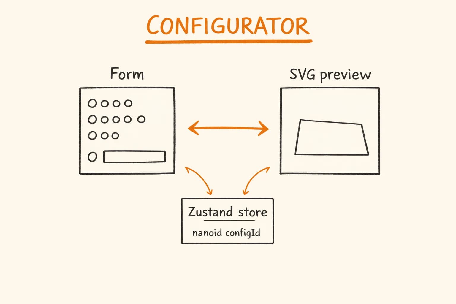
In the shop, the picked color’s name pre-fills the special-order request, so what the buyer saw is what lands in the message. If you are building a similar configurator, the state side is covered in the React configurator article.