
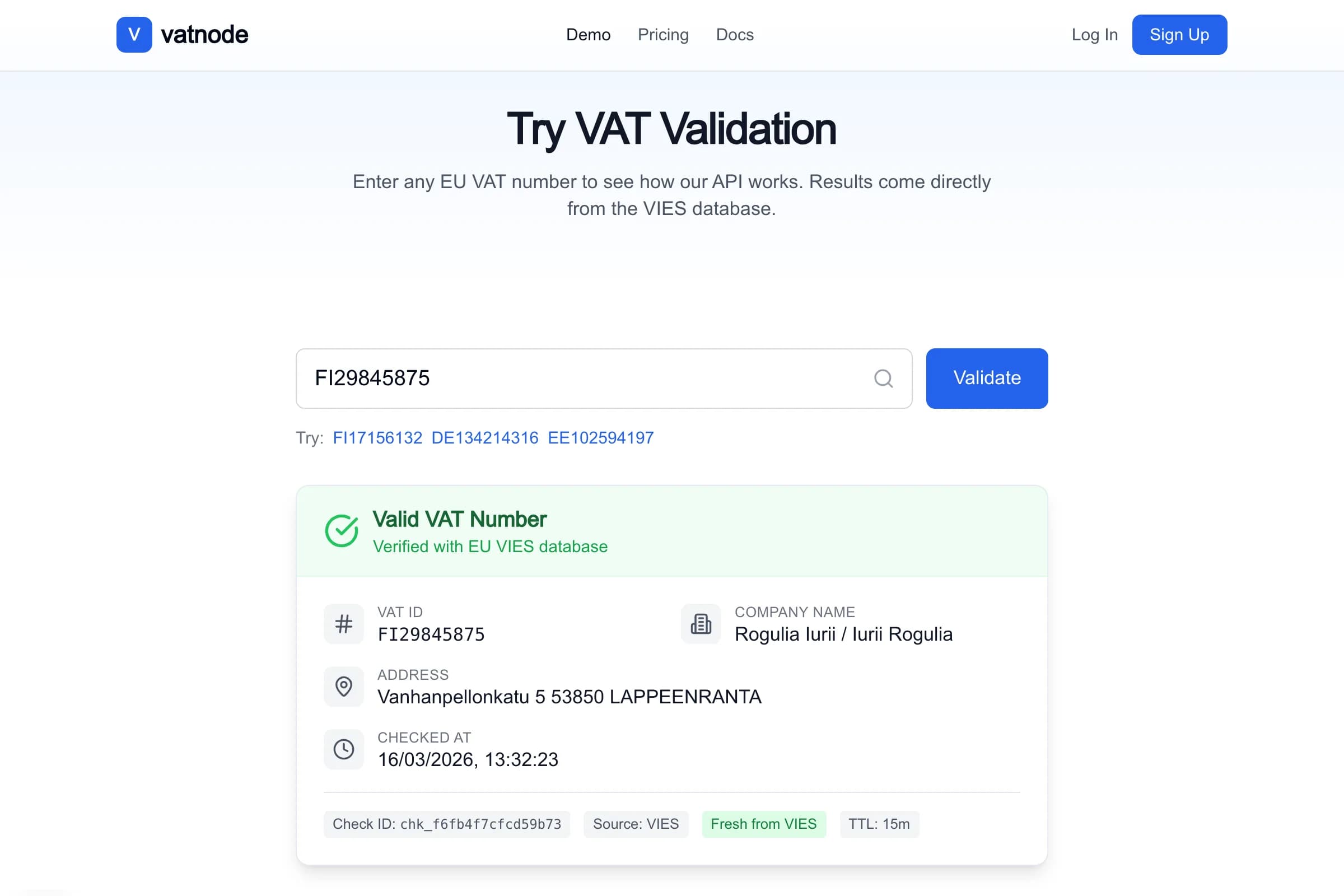
Developer-first SaaS API for EU VAT validation via VIES with Redis caching, change monitoring, and webhook notifications.
Role-gated admin dashboard for the HTPBE? SaaS platform – real-time KPIs, per-user quota tracking, and a zero-dependency bar chart, all server-rendered via React Server Components.
Libraries
Databases
Services
Key Results

Once HTPBE? went live with paying customers, operating the platform blind became a real problem. I needed to answer everyday business questions: how many users converted to a paid plan this month? Which accounts are close to their quota limit and likely to upgrade? Did a specific user actually use the product, or just sign up and disappear?
The answers existed, but scattered. The Stripe dashboard held billing, the raw database held usage, and stitching them together on every question was slow and error-prone. There was no single place to see the health of the business – who is active, who is at risk, who is worth a nudge toward a higher plan.
I built one internal dashboard that combines everything an operator needs on a single screen: total users and conversion rate up top, a plan-by-plan breakdown, and a per-account drill-down showing usage, quota progress, subscription state, and recent activity. No separate backend, no extra data-fetching library – the pages read straight from the database and render as finished HTML.
Three design decisions drove the value. First, the whole admin area is locked to the owner’s account with a server-side check that runs before any data loads – there is no browser-side toggle to bypass. Second, quota usage is always counted live from the underlying activity, never from a stored counter, so the numbers can’t quietly drift out of sync and mislead a billing decision. Third, each account carries a colour-coded quota bar (yellow as it fills, red near the limit) so accounts approaching their cap – the natural upgrade candidates – surface at a glance. Stripe customer and subscription links sit right on the page, so investigating a payment issue is one click, not a copy-paste hunt.
The result is a single operational cockpit for the SaaS: who converted, who is active, who is near their limit, and where each account stands in Stripe – answerable in seconds instead of by cross-referencing tools.
| Metric | Value |
|---|---|
| Client JS for data | 0 kB – fully server-rendered |
| Chart library | None – pure JSX, ~40 lines |
| Quota drift risk | Eliminated – calculated live from checks table |
| Queries per page load (overview) | 4 parallel (users, month checks, all-time checks, subscriptions) |
| Queries per page load (detail) | 5 parallel (user, month checks, all-time, daily chart, API keys + recent checks) |
| Access control | Single email check, server-side, before any data query executes |
The overview aggregates KPIs across every account – total users, conversion rate, and live checks this month and all-time – plus a plan breakdown bar (free / starter / growth / pro / enterprise). The main table lists all users newest first with a plan badge, subscription status, live and test usage this month, all-time counts, and a quota progress bar, each row linking to a per-user page.
Each per-user page shows a subscription card (plan, status, monthly quota, current period, overage, and direct Stripe links), the account’s API keys with their environment and last-used status, a 30-day activity chart, and the 100 most recent checks with full result and file metadata.
For the technically curious, here is how the core pieces are built.
Both admin routes are React Server Components under the existing (dashboard) layout group: an overview at app/(dashboard)/dashboard/admin/page.tsx and per-user detail at app/(dashboard)/dashboard/admin/[userId]/page.tsx. The guard runs at the top of each, before any data is fetched:
// app/(dashboard)/dashboard/admin/page.tsx
const session = await auth();
if (session?.user?.email !== "[email protected]") {
  redirect("/dashboard");
}
Next.js redirect() in a Server Component throws immediately, so no data queries execute for unauthorized sessions. There is no client-side conditional rendering to bypass.
The overview page runs four parallel queries: all users, monthly checks grouped by user and environment, all-time checks grouped the same way, and current subscriptions. Grouping by environment in SQL (rather than filtering in JavaScript) means the database does the work once:
// app/(dashboard)/dashboard/admin/page.tsx
const monthCheckRows = await db
  .select({
    userId: apiKeys.userId,
    environment: apiKeys.environment,
    total: sql<number>`cast(count(*) as integer)`,
  })
  .from(checks)
  .innerJoin(apiKeys, sql`${checks.apiKeyId} = ${apiKeys.id}`)
  .where(gte(checks.checkDate, monthStart))
  .groupBy(apiKeys.userId, apiKeys.environment);
The result rows are indexed into a Map<userId, { live: number; test: number }> in JavaScript before rendering – one pass, no repeated array searches per table row. The plan breakdown bar is derived from the same allUsers array: group by plan field, count each bucket, compute percentage. No extra query.
Quota uses the same dynamic calculation as the public API – live checks this month counted from the checks table, never from a stored counter. This keeps the dashboard consistent with what the user sees in their own dashboard and avoids the class of bugs where a counter drifts out of sync after a failed transaction:
// app/(dashboard)/dashboard/admin/[userId]/page.tsx
const limit = user.requestsPerMonth; // null = unlimited (Enterprise)
const usagePct = limit ? Math.min(Math.round((monthLive / limit) * 100), 100) : 0;

// Progress bar colour: red ≥90%, yellow ≥70%, primary otherwise
const barColor = usagePct >= 90 ? "bg-red-500" : usagePct >= 70 ? "bg-yellow-500" : "bg-primary";
Overage (checks beyond the monthly quota) is surfaced separately so I can see accounts that went over before a plan upgrade was processed.
I considered Recharts and Chart.js but rejected both – a single bar chart does not justify a 200+ kB dependency in an internal tool. The chart renders in pure JSX: a flex row of proportionally scaled div elements, each with a CSS height set from the day’s count relative to the month’s maximum. Days with zero checks still render (height 0), which keeps the x-axis gaps honest:
// app/(dashboard)/dashboard/admin/[userId]/page.tsx
// Fill all 30 days from epoch-day arithmetic so zero-check days are explicit
const todayDay = Math.floor(Date.now() / 1000 / 86400);
const dailyMap = new Map(dailyRows.map((r) => [r.day, r.count]));
const chartDays: { label: string; count: number }[] = [];

for (let i = 29; i >= 0; i--) {
  const day = todayDay - i;
  const d = new Date(day * 86400 * 1000);
  chartDays.push({
    label: d.toLocaleDateString("en-GB", { day: "2-digit", month: "short", timeZone: "UTC" }),
    count: dailyMap.get(day) ?? 0,
  });
}
// Rendered chart — no library, pure JSX
<div className="flex h-32 items-end gap-0.5">
{chartDays.map((day, i) => {
const pct = maxCount > 0 ? (day.count / maxCount) * 100 : 0;
return (
<div
key={i}
className="group relative flex flex-1 flex-col items-center justify-end"
title={`${day.label}: ${day.count}`}
>
<div
className="w-full rounded-t bg-primary/70 transition-all group-hover:bg-primary"
style={{ height: `${Math.max(pct, day.count > 0 ? 3 : 0)}%` }}
/>
{day.count > 0 && (
<div className="pointer-events-none absolute bottom-full hidden whitespace-nowrap rounded bg-black/80 px-2 py-1 text-xs text-white group-hover:block">
{day.label}: {day.count}
</div>
)}
</div>
);
})}
</div>The Math.max(pct, day.count > 0 ? 3 : 0) guard ensures a bar with one check is still visible even when the month’s maximum is in the hundreds.
The main table shows all users sorted newest first: name, email, a plan badge, a subscription status badge, live checks this month with a quota progress bar, test checks this month, all-time live and test counts, and registration date. Each row has a ‘Details →’ link to the per-user page.
The per-user detail page shows:
ChecksTable component already used elsewhere in the dashboard: filename, check date, result badge, origin type, file size, client ID, key name with environment badge, and PDF creator/producer metadataThe Stripe links use the customer ID and subscription ID stored in the users table and require no Stripe API call at render time.
 Available
Need something similar?
I build custom solutions – from APIs to full products. Let’s talk about your project.
Developer-first SaaS API for EU VAT validation via VIES with Redis caching, change monitoring, and webhook notifications.

SaaS platform for PDF authenticity verification with a public REST API.
Libraries
Databases
Services
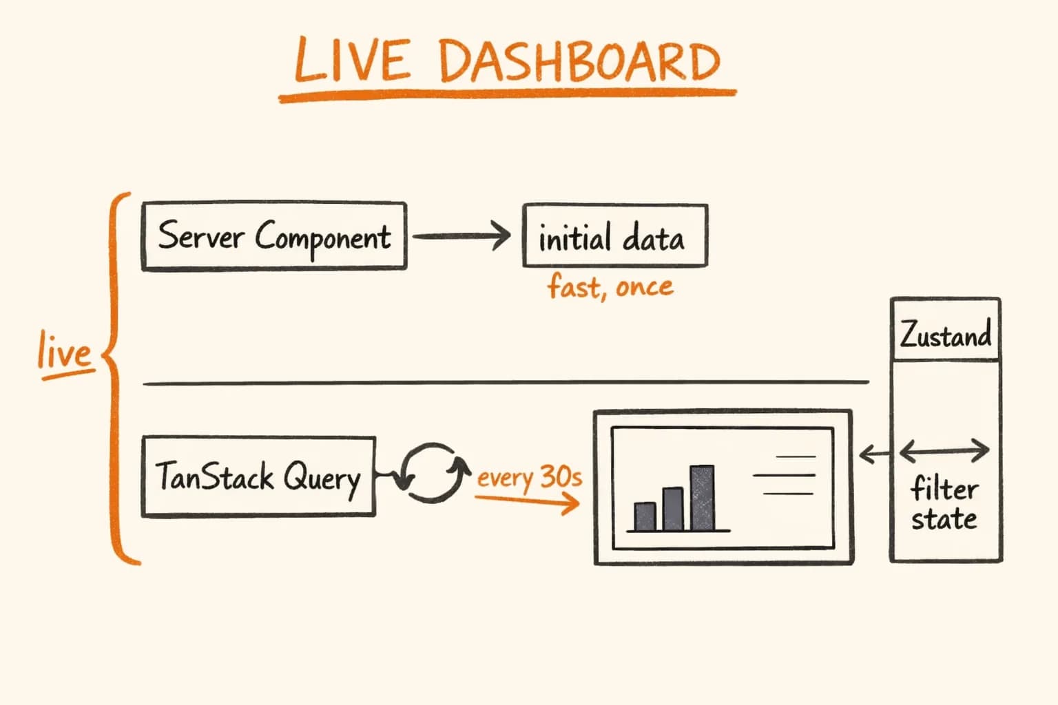
Real-time Next.js admin dashboard: TanStack Query polling, Zustand for filter state, Sentry error boundaries per panel, and a zero-dependency bar chart.
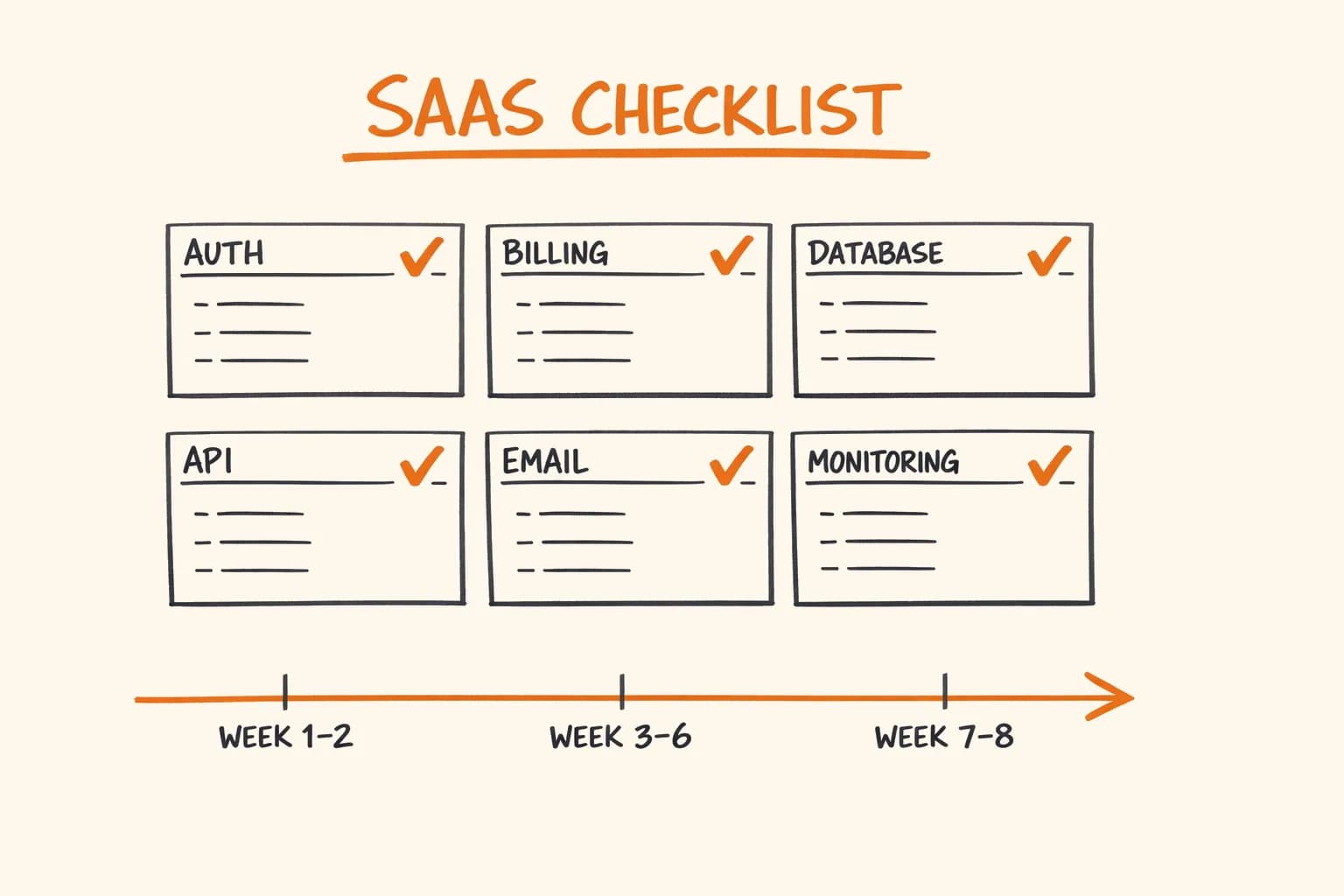
40+ point production SaaS checklist: auth, Stripe billing, PostgreSQL, rate limiting, email, monitoring, and security – with honest 8-week build estimates.
Stack
Databases
Topics